Experiment Results
Once your experiment is up and running, you will be able to track how it is performing in the Experiment Results tab. This can be found on any Experiment page under the Results tab at the top.
There, you can update your analysis, configure how you want your analysis to run, and see the impact of your experiment on your metrics.
Experiment Results Table
The heart of the experiment results page is the table of results. What you will see will depend a little bit on whether you are using our Bayesian or our Frequentist engine, as well as whether your experiment has 2 variations or if it has 3+, but in either case the first two data columns will look the same, and each row will represent one comparison between baseline and variation for one metric.
In both engines, the first two data columns are:
Baseline - the average value of the metric in the baseline variation; either a percentage of users in that variation (for proportion metrics) or an average value for mean or ratio metrics. Variation the average value of the metric in the comparison variation.
For both columns, the raw data in grey underneath shows the numerator and denominator totals.
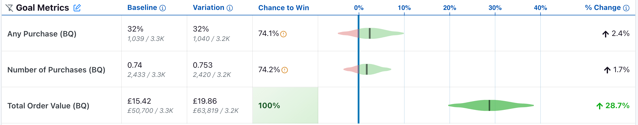
Bayesian Engine
Chance to Win tells you the probability that the variation is better. Anything above 95% (a customizable threshold set at the organization level) is highlighted green indicating a very clear winner. Anything below 5% is highlighted red, indicating a very clear loser. Anything in between is grayed out indicating it's inconclusive. If that's the case, there's either no measurable difference or you haven't gathered enough data yet.
The graph and the % Change column show you how much better/worse the variation is compared to the baseline. It is a probability density graph and the thicker the area, the more likely the true percent change will be there. As you collect more data, the tails of the graphs will shorten, indicating more certainty around the estimates.
Frequentist Engine
If you select the "Frequentist" engine, when you navigate to the results tab to view and update the results, you will see the following results table:
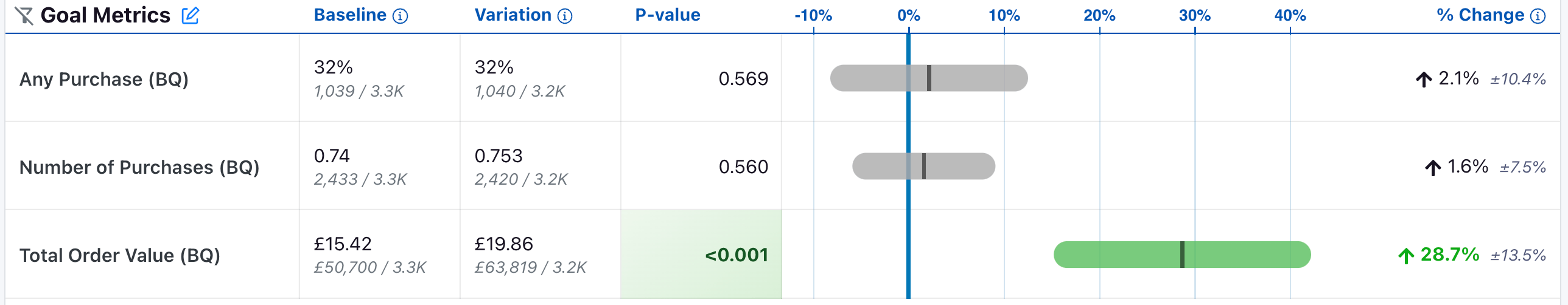
The P-value column is the probability that the experiment effect for a variation would have been observed if the true effect was zero. When the p-value is less than 0.05 (a customizable threshold set at the organization level) and the experiment effect is in the preferred direction, we highlight the cell green, indicating it is a clear winner. When the p-value is less than 0.05 and the experiment effect is opposite the preferred direction, we highlight the cell red, indicating the variant is a clear loser on this metric.
The graph now represents a 95% confidence interval (or 100*(1 - )% confidence interval if you have a custom significance threshold other than 0.05).
The % Change column is unaffected, although we now also represent the width of the confidence interval in grey.
Metric Drilldown
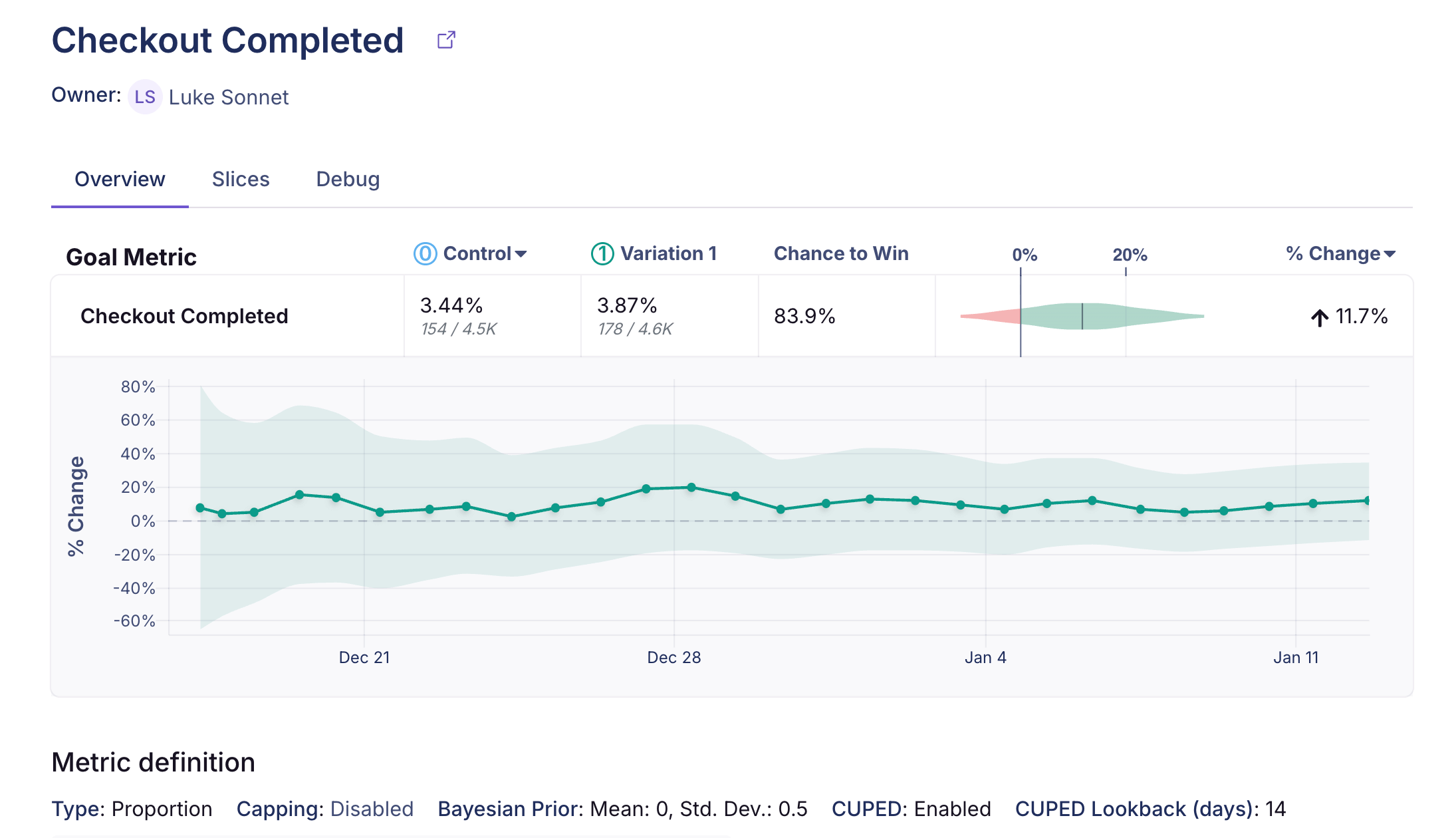
Clicking any metric or slice row in the results table opens the Metric Drilldown modal, which provides a focused view of that metric, its slices, and more debugging information. The modal includes three tabs:
- Overview - Metric details and time series for the metric, a link to the metric page, a results table for that metric with analysis controls (baseline, variation filter, difference type), and a metric card showing key information.
- Slices - All slices for that metric displayed in a searchable, sortable table. Clicking a slice row in the main results table opens the modal with the Slices tab focused and that slice pre-filtered for quick exploration. This is also where time series for metric slices are displayed.
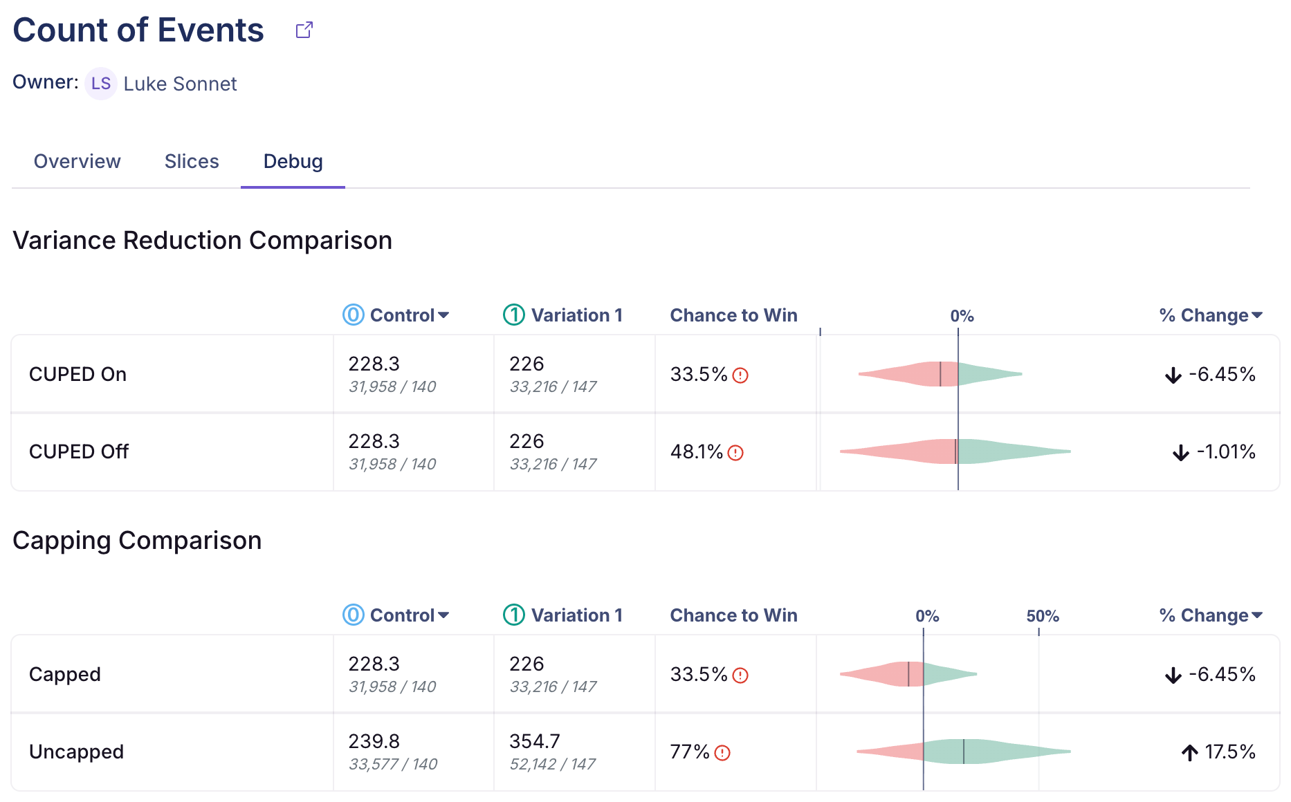
- Debug - Debug information for power users to show the impact of: CUPED, Post-Stratification, Capping, and informative priors (Bayesian engine only).
For more information on how metric slices are defined, see Metric Slices, an Enterprise-only feature.
Guardrails
Guardrail metrics are treated much like regular metrics, but they are placed in a separate part of the results view and are not part of any p-value corrections in the frequentist engine (in other words, even with p-value corrections applied, these results will be more sensitive to negative or positive trends). They also can be used differently from regular metrics in the Experiment Decision Framework.
Results Table Settings
There are several settings at the top of the results table that allow you to control your results.
Variations
This option allows you to filter which variations are shown in the results table, in the case that you have 3+ variations in your experiment.
Baseline Variation
This option allows you to change which variation is the baseline variation. This is particularly useful in the case when you have one control and two treatment variations. In this case, our result defaults to showing you the statistics comparing each treatment variation versus the baseline variation, but you may want to additionally analyze how the treatment variations compare to one another.
In that case, you can switch the baseline to be one of the treatment variations to directly compare treatment 1 to treatment 2.
Difference Types
A "difference type" is the way we measure the difference in variations. There are three difference types that you can select from"
Relative- The default, this is the relative change or "uplift" of your variation when compared to the baseline. Specifically, theRelativechange is where and are the averages in the treatment and baseline variations respectively. Effects here tell you that the average user value in the variation was X% greater than the average user value in treatment. For example, if your metric is Revenue and your baseline average is 10.00 and your variation average is 10.31, then yourRelativechange is 3.1%.Absolute- This is simply the difference in average values across your variations --- . This can help you understand the raw difference in average values, e.g. the treatment leads to an increase in revenue of $0.31 per user in the above example.Scaled Impact- This helps you understand the daily total (as opposed to average) effect that your experiment would have had if 100% of users that would have been exposed to your treatment variation had gotten that treatment variation. It is computed as , where is the number of users that are in your treatment variation, is the percent of all traffic that is in that variation, and is the number of days in the current phase used for the results. So if your experiment ran on 10% of traffic for 20 days, with 5% going to the treatment variation, and there were 5,000 users in your treatment variation, the scaled impact would be dollars per day. This implies that this experiment would have lead to a increase in total revenue per day if every user that could have been exposed the variation had been exposed to the variation.
These difference types can have slightly different statistics because for Relative effects we need to account for the uncertainty in estimating (which forces us to use a delta method derived variance to properly handle). For more details, see the Statistical Details.
Furthermore, with CUPED enabled, you may find that the changes are not exactly the same as the difference in raw variation averages, due to CUPED adjusting those averages under the hood to reduce variance.
Dimensions
Dimensions allow you to slice and dice your data, but require additional queries to compute.
User or Experiment
If you have defined dimensions for your data source, you can use the Unit Dimension dropdown to drill down into your results. For SQL integrations (e.g. non-MixPanel) GrowthBook enforces one dimension per user to prevent statistical bias and to simplify analyses. For more on how GrowthBook picks a dimension when more than one are present for a user, see the Dimensions documentation. This is very useful for debugging (e.g. if Safari is down, but the other browsers are fine, you may have an implementation bug) or for better understanding your experiment effects.
Be careful. The more metrics and dimensions you look at, the more likely you are to see a false positive. If you find something that looks surprising, it's often worth a dedicated follow-up experiment to verify that it's real.
Date
The date dimension shows a time series of the count of users first exposed to an experiment, as well as effects when comparing users first bucketed on each day.
Take the following results, for example.
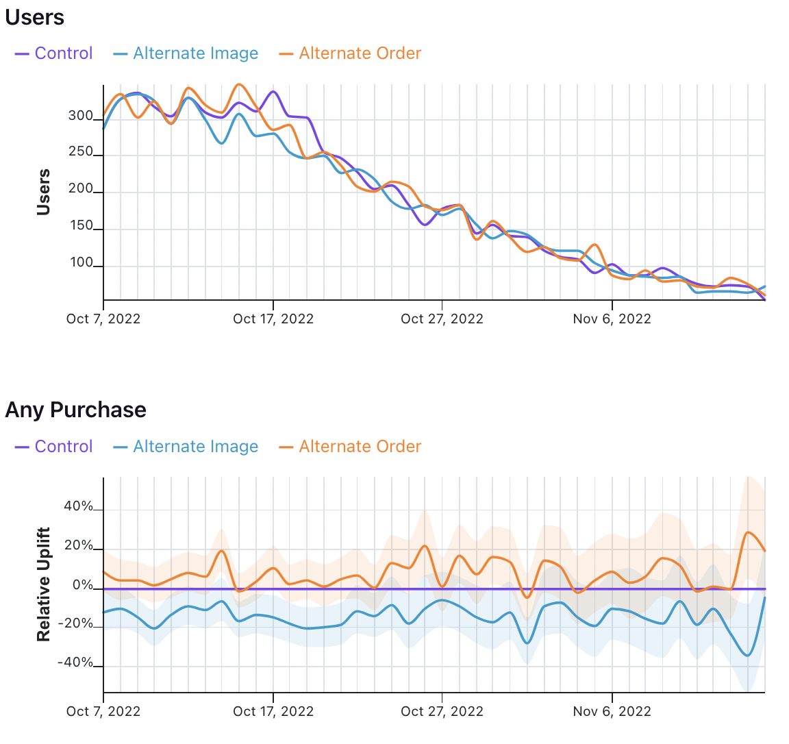
In the first graph, we see the number of users who were first exposed to the experiment on that day.
In the second graph, we see the uplift for the two variations relative to the control for all users first bucketed on that day. That means that the values on October 7 show that users first exposed to the experiment on October 7 had X% uplift relative to control, when pooling all of the data in their relevant metric window. It does not mean show the difference in conversions across variations on October 7 for all previously bucketed users.
Experiment Health
By default, GrowthBook runs several health checks on your experiment to help you diagnose if there are any issues with the configuration.
Health checks appear in two places in the app:
- On the results tab -- we insert Experiment Balance and Multiple Exposures warnings for all experiments that might be untrustworthy right into your results tab
- On the health tab -- if you have health traffic queries enabled, we can run additional queries to further dig into any experiment health issues
Experiment Balance (SRM)
Every experiment automatically checks for a Sample Ratio Mismatch (SRM) and will warn you if found. This happens when you expect a certain traffic split (e.g. 50/50) but you see something significantly different (e.g. 46/54). We only show this warning if the p-value is less than 0.001 (customizable in your Organization Settings), which means it's extremely unlikely to occur by chance.

Like the warning says, you shouldn't trust the results since they are likely misleading. Instead, find and fix the source of the bug and restart the experiment. You can find more information about potential sources of the problems in our troubleshooting guide.
Under the hood, we are conducting a standard chi-squared test for Sample Ratio Mismatch, which compares the distribution of observed units to the expected units and computes a p-value for the probability of observing this traffic split if the traffic split were truly unbiased.
Pre-Exposure Bias Check
This alert indicates that there is a large difference between the pre-exposure mean of the baseline variation and the pre-exposure mean of a test variation. This means that the baseline and test groups were substantially different with respect to a goal or guardrail metric before the experiment started. While some degree of imbalance is expected, this alert is raised if the imbalance is statistically significant.
This matters because large pre-exposure mean imbalances can bias results, leading to incorrect shipping decisions.
If SRM or multiple exposures fails, then these should be investigated first. If the pre-exposure mean imbalance is not caused by SRM or multiple exposures, then potential causes include:
- outliers in the pre-exposure metrics: if a few extreme values are causing the imbalance, then consider capping your metric.
- incorrect timestamps for aggregated data: if you are using daily pre-aggregated data, please ensure your daily metric timestamps are at the end of the day, rather than the start. This ensures that metric data from the first day of exposure always comes after exposure timestamps.
- exposure latency: if there is a lag between when the exposure event happens and when it is recorded in the events table, then post-exposure metrics could be counted as pre-exposure. If your lag is large and cannot be reduced, then consider metric delays, which shift the pre-exposure window to exclude the lag period.
- mismatch between randomization unit and analysis unit causing unreliable inference: if you are randomizing on session_id but analyzing by user_id, then attribution of the metric outcomes to multiple sessions for the same user can imbalance results.
We use the frequentist engine with sequential testing disabled to calculate the p-values for the pre-exposure mean imbalance, with a significance threshold of 0.001. We calculate the p-values for the pre-exposure mean imbalance using a two-sample t-test on the absolute difference in means.
We adjust for testing multiple metrics using a Bonferroni correction including all goal and guardrail metric-variation pairs as standalone tests. We exclude secondary metrics from causing the overall health status to fail as well as from contributing to the Bonferroni-corrected threshold. This means if you have 3 arms (2 variation test arms), 2 goal metrics, 35 secondary metrics, and 2 guardrail metrics, we would correct for a total of (2 goal _ 2 arms + 2 guardrail _ 2 arms) = 8 total tests.
Note: we exclude metric slices and quantile metrics from the pre-exposure bias check.
Multiple Exposures
This alert indicates that there a substantial number of users (or other unit) in your experiment that have been exposed to multiple variations. At its core, this means that your Experiment Assignment Query is returning data that has rows that look like the following:
| user_id | timestamp | experiment_id | variation_id |
|---|---|---|---|
| 123 | 2022-08-23-10:53:04 | my-button-test | 0 |
| 123 | 2022-08-23 10:53:06 | my-button-test | 1 |
This indicates that for some reason your identifier type (in this case user_id) is being tracked with multiple values of variation_id and it is impossible to tell which variation to assign to that user. This can happen if:
- Your SDK is misaligned with GrowthBook's identifier types for some reason. For example, it's possible that the identifier type you're using as the hash attribute in the SDK is different from the one you're firing in the
trackingCallbackto your warehouse. Ensure that the id you're using to hash users is the same one that you see in your data warehouse for a given user. - If you're using something other than GrowthBook for experiment assignment, there are many possible reasons for this issue:
- A bug with the third party solution's hashing algorithm
- A mismatch between the identifier type that you have set up in GrowthBook and the ID that is being used to assign variations in that third-party solution
- A mistaken in your Experiment Assignment Query that is returning the wrong
variation_idor identifier type for a given experiment.
Health Tab
To get access to the health tab, you need to enable us to run one additional query per experiment analysis. You can do this on a health tab for any experiment if you have the requisite permissions to run queries.
The health tab provides you with more insights on the traffic to your experiment over time and across dimensions.
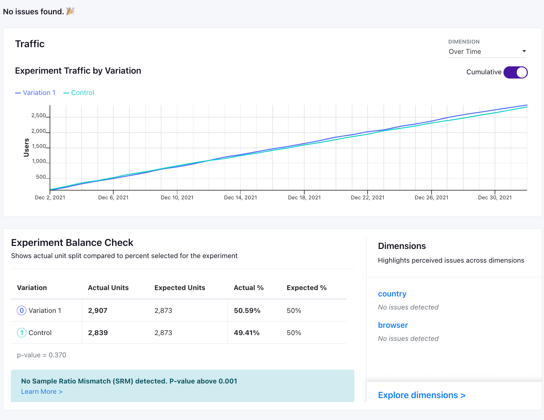
Experiment Traffic - A plot of experiment units by the first date they were exposed to the experiment. You can look at daily traffic or cumulative traffic. If you have your experiment dimensions configured with pre-defined slices, we will also return traffic splits by dimension in this tab. For example, if you have a browser dimension with pre-defined slices, we will show you the traffic splits by browser.
Experiment Balance Check - A table with information on the actual number of experiment units, the expected number, and the differences between the percent traffic allocated to each bucket.
We also provide you with checks by any pre-defined dimension slices you have configured for your experiment dimensions.
Adding Dimensions to Health Tab
Your health tab shows dimension breakdowns only for Experiment Dimensions which have pre-defined slices.
When setting up the health tab, you will be prompted to configure your Experiment Dimensions to have pre-defined slices that can be used in the health tab. This is optional, but we require pre-defined slices for your experiment dimensions to compute dimension traffic and health checks so that we can run only one additional query per analysis and get reliable results.
If you want to refresh your dimension slices or change your dimension definitions, you should do so via the Data Source page for the related data source. You can read more about that here.
Sharing Experiment Insights
Share insights for A/B tests or bandits in 2 ways: Share the full experiment or create a custom report.
Sharing a Full Experiment
Share a live view of your experiment that automatically updates with the latest data. Viewers can explore the experiment details, variations, and metrics without making changes.
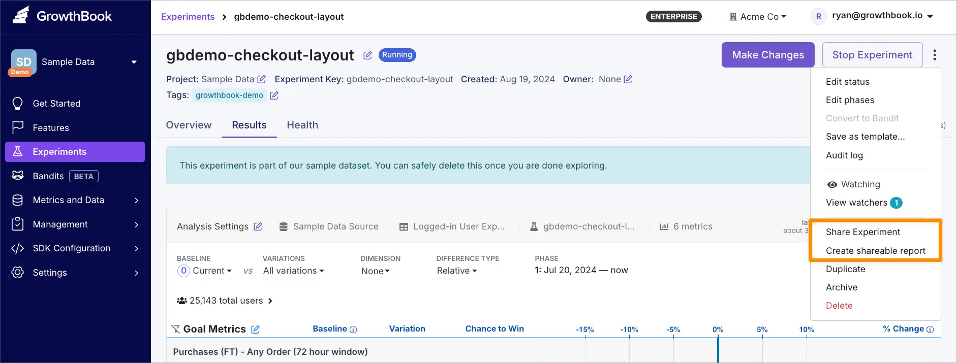
To share an experiment:
- Go to the experiment page
- Click the overflow menu (⋮)
- Select Share Experiment
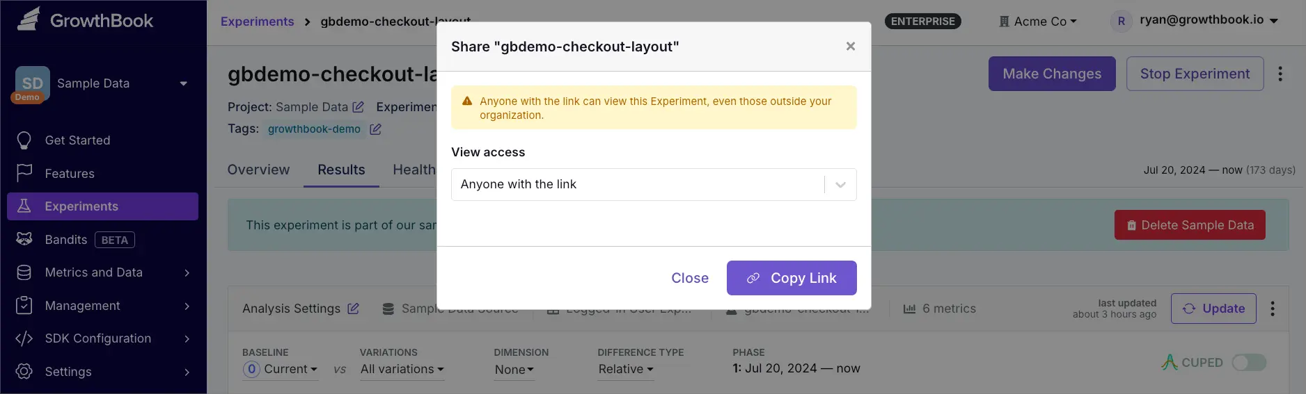
- Choose View access
- Only organization members: Available to anyone in your organization
- Anyone with the link: Available via public link
Changing access from Anyone with the link to Only organization members will invalidate existing public links.
Creating a Custom Report
Create point-in-time snapshots to capture specific analyses or time periods. Custom reports are ideal for documenting important findings or sharing focused analyses.
To create a shareable custom report:
- Go to the experiment page
- Click the overflow menu (⋮)
- Click Create shareable report
- Click Edit Analysis to customize content
- To edit report name and description, click the overflow menu (⋮) → Edit Name & Description
- Click Share
- Choose View access
- Only me: Private report visible only to you.
- Only organization members: Visible to your organization.
- Edit access: Allow specific organization members to modify the report
Reports can be manually updated to reflect current data or any specific date range.
Managing Custom Reports
Access your reports from the Custom Reports section in the experiment's Results tab.
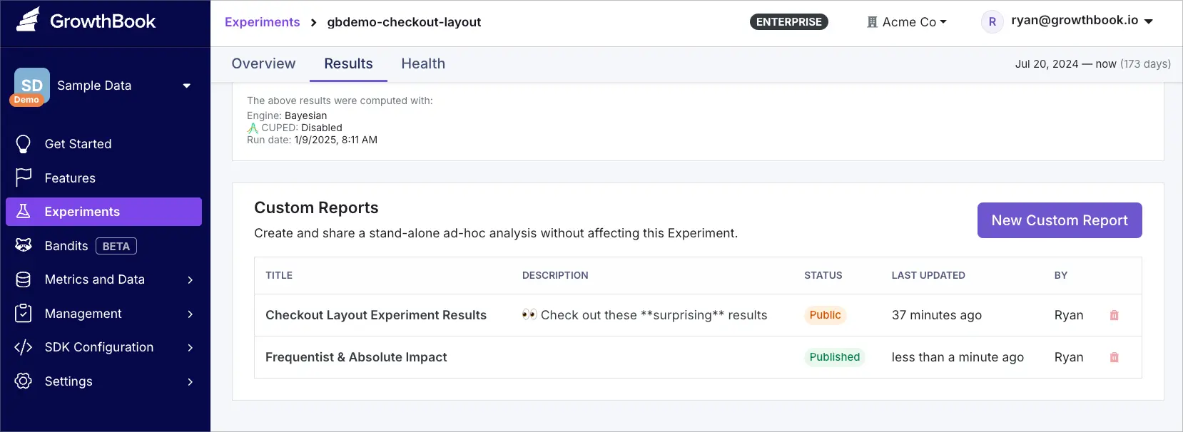
From here you can:
- View existing reports
- Edit report contents
- Manage sharing permissions
- Delete reports