Experiment Time Series
The time series chart shows the cumulative results of your experiment. It's accessible from the Metric Drilldown available from the experiment results view. Click on the row for the metric whose time series you want to see.
Each data point represents cumulative results for that day. When there are multiple updates within a day, GrowthBook consolidates them into a single daily point to keep the chart easy to read.
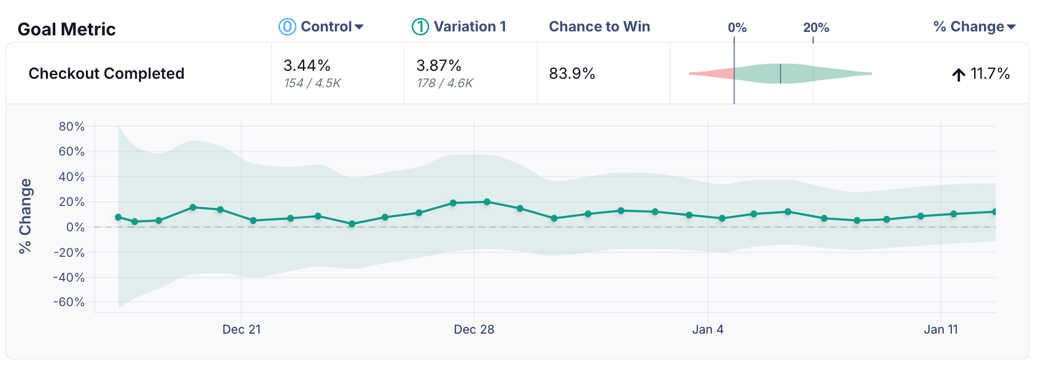
Selecting a difference type (Relative, Absolute, Scaled Impact) will change the y-axis of the time series to the relevant effect. Selecting a different baseline variation will hide the time series as they are only computed for the default baseline variation.
FAQ
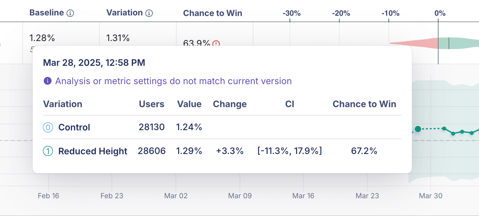
Why is some part of the time series dotted?
A dotted line in the time series indicates a period when metric settings or analysis settings were different from the current settings or results. Because older data may not be directly comparable, the dotted line shows historical results where comparability is less certain. (A solid line line indicates results that are immediately comparable.)
Why aren't the intervals between data points not equal?
The time series reflects experiment refreshes, not fixed time intervals. If updates occur irregularly, the spacing between points will vary.
Why does the time series only go back so far?
The time series will only go back as far as the oldest experiment update (and as far back as late March 2025, when the time series feature was launched). If you have not manually refreshed the experiment results, then the time series will only go back to the last time the experiment was refreshed.
Furthermore, if you add a metric mid-experiment, the time series will only show the history of the metric as long as the metric has been in the experiment.